


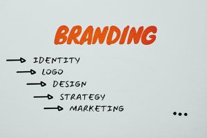
For the last appointment of the year with Michele Bondani, let’s explore a very important marketing topic in the strategic choices that a company, over the course of its life, is called to make, that is the restyling of the logo to get a new positioning on the market
“Less is more” is a maxim that applies in every field, especially nowadays where we are literally invaded by content and information from everywhere, starting from the web, which plays a dominant role in this.
If we think about the way companies communicate, especially those born and developed immediately after the war, and we go to see the evolution of the logos of these realities, it will be immediately clear how in the past an extremely rich style dominated, sometimes even baroque, made of hems, laces, italics or typefaces and the use of too many colors, as if to underline the prestige of the products with these communicative canons. Those were years in which we emerged from misery, there was a need for well-being, to think about the concept of wealth that was to act as a counterbalance to exorcise the dark times of the past.
Simplicity dominates the new communication styles, from graphics to the web
 “The communication styles conceived in the 1950s had been tailor-made for the media of the time, mainly printed paper and signage in the cities that were developing, and on these media they had to find the maximum of their exaltation in the eyes of the consumer” and the packaging of that time was influenced by these concepts, says Michele Bondani, founder of Packaging in Italy.
Today a company logo is designed and developed starting from the technical and graphic standards required by the web. And here too, compared to 20 years ago, the characteristics have changed, at such an extent that at the beginning more squared shapes were used while today it is the round shape that reigns supreme.
“Today the presence on all social networks requires a graphic representation of one’s image in a rounded shape, an aspect that creates coordination and recognition. A suggestion that I would like to give to anyone who wants to approach a restyling project is to be guided by the concept of simplicity, which always pays off”, adds Bondani.
 An example that can help to better understand this concept concerns the restyling of Juventus logo. A brand that had in the zebra contained in the classic oval its maximum expression of recognition for Juventus world has been replaced after years by the new logo, this double JJ where everything that does not respect modern communication canons has been removed, to convey the new positioning and setting out to conquer new markets. This is the period in which the new stadium starts, a much stronger commercial strategy than in the past and a logo that is still strong and identifying, which in its lettering almost gives the illusion of composing itself in the classic oval shield of the past.
 “In the 90s we saw a trend that saw the inclusion of shades and shadows in company logos to simulate the three-dimensional effect. Today we are instead in the era of flat, clean logos, freed from any graphic element, a communication style that marries the guidelines of web communication”, adds Michele Bondani.
Still for the concept of cleaning, removing elements rather than inserting, in the early years of the web we have witnessed the proliferation of many generalist portals, such as libero, yahoo, tiscali, which in competition with google wanted to offer their own search engine service, inserting a whole series of information, news, within their portal, which would clog the home page, practically overshadowing the true functionality of the search. Instead, Google has chosen, on the contrary, to insert only the strip where to insert the word, on a white page, dominated by its logo. A simple, clean choice that has been rewarded by users who in fact have decreed the success of leader as the only search engine. There is now no trace of the other proposals.
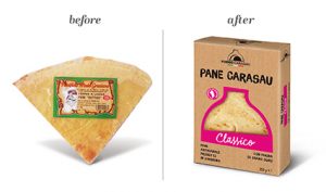
Essential packaging for better communication
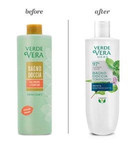 “The same communicative concept applies to packaging as well. The first rule of packaging positioning is to simplify. Today the consumer is studded with information from everywhere and rewards all those solutions that manage to achieve their goal with just a few elements, without creating confusion, and this need when you are called to a brand restyling can become complicated, there are some dangers to know that must be avoided. Sometimes it is advisable to follow a path that leads to the restyling of the logo following various steps, while other times you can also dare to make a drastic and sudden change, which in the eyes of the layman may seem wrong, but only for the fact that it is proposed by leading companies, with important budgets available, it can only be a successful strategy”, continues Bondani, recalling the importance of relying on the leading experts in the sector.
 Big players can therefore afford the luxury of upsetting their image, which has remained the same for decades and doing it in one fell swoop, having success; different is the approach for medium-small brands, for which a restyling in small steps is always suggested with an intermediate step, to avoid traumatizing the consumer who could find himself displaced.
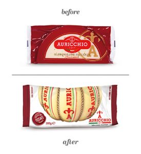
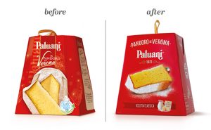 “In my experience we have been involved in important restyling operations, from Auricchio cheese, to Augusta and Paluani as regards the leavened products, in the category of reds, a 100% Tuscan tomato, up to the last job that after holidays saw us support the company Roberto, producer of bread for toast, hamburgher, hot dogs, in the reinterpretation of their logo and therefore the whole line of packaging that you will see on the shelves starting from the first months of the new year”, concludes Michele Bondani, already giving us the cue for the next in-depth study, in which, remaining on the subject of restyling, we will analyze the case history of the Tuscan company Primetta, specialized in tomato preserves, which turned to Packaging in Italy for this important repositioning operation.