


We reached the end of the journey with Michele Bondani of Packaging in Italy, two years of articles where we deepened the knowledge of the world of packaging from a different point of view, with valuable advice and successful case histories. We will certainly have the opportunity in the future to speak with Michele and his agency; for this latest contribution on Converter we will focus on the importance of color in packaging and therefore in the sales process
By Andrea Spadini
Color codes are a key element to take into consideration when designing new packaging. The first aspect that guides the use of colors is linked to the identification of a product category, and thinking for example of the food sector, when it comes to wholegrain products, the colors that come to mind are the various shades of brown; for organic and well-being the associated color is green. The other factor influencing and defining the trend, as regards the use of a certain color, is the success achieved by the leading companies within a specific category, let’s think for example of the famous blue for pasta. 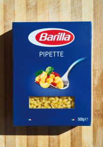 Barilla was a company that acted as a training ship as regards its category, managing to impose the splash of color on the shelves of points of sale, stimulating many medium-small competitors to create similar situations, a trend that was very popular in 70s-80s but also 90s to replicate the business model of the market leader, hoping to get even a small part of the success. If we think about it, after the launch of Barilla blue, the trend for the pasta category has been to rely heavily on blue-azure color code.
Dare and think differently
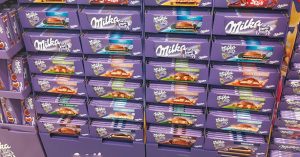 “Today the trend has changed, and there are several pasta manufacturers that have decided to change their approach to the sector, putting aside the unstoppable desire to copy the market leader, to propose its own idea that allows them to position himself in the market with a very specific identity”, says Michele Bondani, but to do this the entrepreneur must be courageous and overcome some prejudices and mental barriers, as Milka did in confectionery sector with the famous lilac.
The color code must be powerful, hitting the mind of the consumer who will automatically associate it with the brand and over time will be obtained the critical mass effect capable of decreeing the success of a product.
“The color code within the category is fundamental and for the products that have a limited time of exposure it becomes even more important. I am talking about the products for the anniversaries, such as panettone, where to an iconic red or blue color of the market leaders, over the years, in order to distinguish themselves there have been players who have ventured, in clear contrast, presenting a packaging where the dominant color was white, with a special finishing to add value to the packaging with reliefs and gold writings”, adds Bondani.
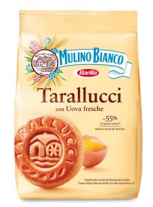 As regards biscuits and shortbread sector, the color is associated with the type of product contained in the packaging, therefore to the straw yellow color of Mulino Bianco packs the consumer automatically connects the color of eggs, wheat, and this aspect was taken up by many private labels, making a counterintuitive action since it had already been proposed by the market leader and it should not be repeated. It is no coincidence that private labels use price as one of the main levers to attract consumers.
Color code and graphic livery
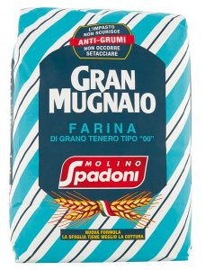
 “My invitation is not to rely on the case but to choose a partner, and to follow the advice of the consultant, leaving aside the fear and perhaps build a path that can lead the company to adopt a well – recognizable and distinctive livery on the market. A widely used term when it comes to motorcycles, I believe that we can speak of livery even in the packaging field. I remember the graphics chosen by Spadoni mill that has entrusted itself to a regimental style livery, such as the ties, proposing an identity and highly recognizable packaging, composed not only by the color code but also by a graphic style. The same approach carried out by Proraso in the beard foam, where the green color, which recalls the fresh taste of the mint, has also been proposed here in regimental style.
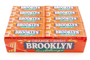 Color codes that can then change when you extend the line, as in the case for example of the Chewin-Gum Brooklyn, with the color of the package in line with the taste of the different tastes” says Bondani.
In summary, therefore, the color code commands the category, and the first problem to face for the company is to understand in which category to position, understand why a certain color code has come, then having the courage to change, however avoiding to falling into the error of proposing a line extension, but continuing with the specific color and graphic code.
The consumer is used to letting himself be attracted, by colors following habit or mind attitude, almost an innate attitude, which, however, can’t be ignored by whom is on the other side.
“When I chose the color code for the logo of Packaging in Italy, I entrusted myself to yellow and black, a combination that I personally do not like and that evokes a meaning of danger in road signs, but capable precisely for this to draw the attention of the consumers and I must say that it worked. Also because then some time later Sky began to propose the latest news in the footer of the television screen just with a black writing on a yellow background, to highlight the importance of the news”, concludes Michele Bondani, stressing that for a graphic agency is much easier to appropriate a color code not present in a category, but the real challenge is to act in a segment where a leader brand is already present, with its own identity and therefore recognizable color code, and try to undertake a different path with a new product and color code, thus avoiding the risk of copying the market leader, strengthening it.
I take this opportunity to personally thank Michele Bondani for the path that we have built in these two years, with the publication of a series of articles that will remain available to the readers of Converter on our website, very interesting insights who allowed us to talk about packaging from another point of view that was not only the technological one.