


Referring back to the last interview with Michele Bondani of Packaging in Italy, published in November-December 2021 issue of Converter & Cartotecnica, we continue with the in-depth analysis about brand restyling, and after having indicated the most important guidelines, let’s analyze the case study of Tuscan company Primetta specialized in tomato preserves since 1969, which has chosen to rely on the staff of Packaging in Italy for this important operation of relaunching the brand to gain a new positioning
Primetta is a historic brand in the production of canned and peeled tomatoes, founded in 1969, in 2012 it became part of Neri Industrie Alimentari, a company in the province of Pistoia among the first leading Italian brands in oil preserves and food preserves. And it is precisely starting from the territoriality of the product that was conceived and designed the restyling of Primetta brand.
 The image of Primetta was linked to a style of communication that remained anchored in the 60s and this approach, especially if you play your challenge in a very crowded market sector such as canned food and peeled tomatoes, is not the best solution if you want to stand out from the crowd. We are talking about a product that is the basis of our cuisine, but which due to its widespread use is practically considered as a commodity, and therefore extremely complex to differentiate.
Telling and enhancing the strengths
“When Neri contacted me for the restyling and repositioning of their Primetta brand, we immediately realized that we were in front of a product that, in terms of font, lettering, stylistic and photographic choice of packaging, conveyed a dated image but above all without enhancing the distinctive features of this product”, Michele Bondani, owner of Packaging in Italy, tells us.
In fact, we are talking about a product that has regionality as its strong point, being grown only in Tuscany, so much so that it is certified, because cultivated without the use of chemical herbicides, harvested by hand and processed at low temperature to preserve its taste and quality, up to packaging during which, again by hand, the famous fresh basil leaf is added, another distinctive feature of this tomato.
A renewal in the wake of tradition
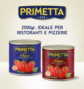
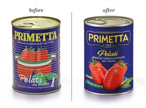
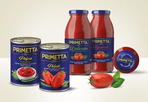
It is quite clear that the topics to bring to the fore to differentiate it from the competition were not lacking at all to Primetta brand, and as we have already underlined in previous articles, relying on competent and qualified partners such as Packaging in Italy can determine the borderline between success or oblivion. Starting therefore from his strengths, Michele Bondani and his staff studied a restyling of the brand and then of all the packaging aimed at enhancing the product aimed at its repositioning. “We have kept all the stylistic balances present on the old packaging, from the corporate pantone blue reflex color of the background to the yellow of the logo, which has been revisited with the choice of a new font that conveys the historicity of the company but in a more modern way, inserting also the year 1969. The image has been replaced, moving even higher the indication of the product that previously appeared to be difficult to read, and also enhancing the origin of the 100% Tuscan product and the presence of fresh basil. From here started the restyling of the other product lines already present in the range, also giving life to the extension of the range with the inclusion of new products (pulp, delicate and rustic passata, the line for catering)”, he adds. Michele Bondani, specifying that for a product restyling and repositioning of this type the main focus is not to upset the usual consumer, who hardly has to realize the changes made. Hence the choice to still use the classic can with a corrugated surface for the peeled tomatoes and pulp and the glass bottles for the passata for which a new cardboard cluster has also been created that houses the 2 bottles for sale in supermarkets.
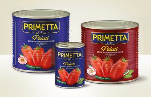
Another specificity that had to be maintained and in some way enhanced and transmitted to the consumer, who led to direct printing on the can without the aid of a paper label, was the peculiarity of being able to exploit this type of packaging directly in cooking (classic bain-marie), a practical, fast system that enhances the organoleptic characteristics of this ready-to-use tomato.
“The preventive study we carried out for this project was decisive in bringing the extraordinary nature of a historic product to the present day: we decided not to modify the structural design of the package, but we changed the graphic and stylistic into a modern key. Sometimes it is easier to start with a totally new project rather than reworking something that already exists. In this case, the total availability and collaboration of our client was of fundamental importance since they understood right away what our intent was and let itself be guided along the path”, concludes Michele Bondani.