


In this issue we discuss with Michele Bondani, owner of Packaging in Italy, how to differentiate yourself on the shelf by exploiting the potential of a good structural design and finishing that can enhance the characteristics of the products. In fact, the need to equip oneself with an R&D department to support the commercial department is increasingly evident also in paper converting industry…
In the last year, that is, since we started publishing our chats with Michele Bondani, owner of Packaging in Italy, we have repeatedly addressed the educational and cultural aspect that lies behind Packaging Positioning®, a science to understand and if approached with the right spirit is the basis of commercial successes capable of turning the fortunes of a company. Never as in this period, certainly of crisis but also of great opportunities, there is a strong need to make correct choices to conquer new market shares and above all consumer confidence.
A structural design expert in every paper converting company
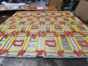
“The aspect linked to the design and development of packaging has always been the task of creative agencies, but the evolution of the market in recent years, also driven by an extreme reduction in costs, has increasingly widened the range of action of printing-paper converting industries, that become the point of reference for the end customer on issues such as design, creativity, structural design, as confirmed by Michele Bondani: “considering the increasingly central role of printer-converter in the decision-making processes linked to packaging design, it becomes quite clear and evident that if I were the owner of one of these companies I would not hesitate a minute to invest resources to equip myself with an expert in structural design to design new dies,
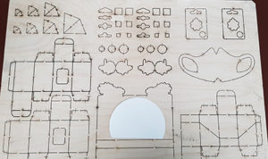
obviously machinable, capable of offering the final customer a differentiation of its packaging starting from a package different from the competition and then potentially winning from the start. Technology today also meets these needs of distinction, with digital technologies such as plotters or laser converting machines, which, not having the need to use the die, become a precious ally of the structural design expert who can give ample vent to imagination. The consultancy aspect also involves the extraordinary world of papers, and also on this aspect it is the printer-paper converter who holds the know-how and can play that precious consultancy role, both towards the creative agency and the final customer.
Differentiate the packaging starting from the structure
“Very often to save on costs, both in terms of design and production of dies in paper converting companies, there is a tendency to offer different end customers the same die already used for other jobs, because it is the most convenient and fastest choice, which allows also of not having to charge the end customer with the costs of a new die”, says Michele Bondani, saying that this very frequent practice clearly encroaches upon the dictates of Packaging Positioning®, that is to differentiate on the shelf from the competition.
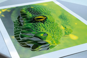
“Certainly the part of creativity and graphic communication is the first aspect of differentiation for a packaging, the one that is reflected in the positioning of the brand, but if then all the work done finds its application on a structural model already used, the risk is that to be perceived as one of many. Packaging with a unique and distinctive structural design is the basis of the 360° philosophy of positioning a product and on this path there is still space for creativity. I give an example related to a product that we have already extensively told in previous episodes, namely the pandoro. Most manufacturers use a classic die, closing the boxes with glue stitches and for these cakes the differentiation is relegated to graphic creativity and use of colors. But there are two products in the same category, namely Bauli and Melegatti, which have used a heat-sealed cardboard packaging that is already extremely differentiating in itself and allows these products to further stand out in the great offer that there is for these products on our shelves during Christmas period”.
Finishing, to stand out without having to change the structural design
Even finishing, today certainly more affordable with the development of digital technologies that have significantly lowered the break-even point for this type of processing, can offer significant opportunities for differentiation in terms of successful packaging.
“In this case we have several examples of packaging which, using the usual structural design, have aimed to stand out on the market through finishing. The cardboard box of Marvis toothpaste, an iconic packaging dominated by green color and finished with a silver relief embossing, an image that we all certainly now have in mind even if we do not see the
package, a sign that the choice carried by the manufacturer has hit the mark perfectly. Marvis is in fact a packaging with a Genetic Profit™”, concludes Michele Bondani, inviting healthy companies to move immediately towards new and innovative projects, because it is precisely in moments like the one we are experiencing, in which competitors will certainly be suffering, that it is possible to take your destiny into your own hands and secure a competitive advantage to cash when the market recovers. The important thing is never stand still!
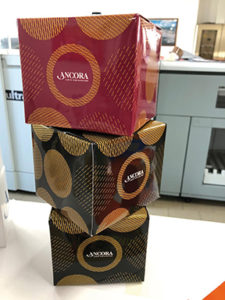
Camoscio d’oro, a case of success thanks to a different structural design
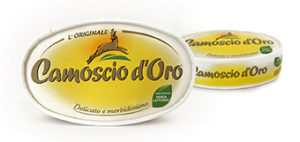 Analyzing the packaging, the naming and the graphic development of the package, we can define Camoscio d’oro a product with a packaging with Genetic Profit™.
The product has its own uniqueness dictated by its clear and distinctive positioning.
Let’s now explore 2 fundamental aspects that make Camoscio d’oro unique: naming and structural design. The naming is made up of the words chamois (camoscio) and gold (oro) where chamois recalls the mountain, altitude, velvet. The word is associated with a strong taste and organoleptic characteristics, while gold is the rewarding part of the naming. It emphasizes the top quality of the product.
The structural design makes it a unique packaging, differentiating and with a convincing, reassuring and unconventional shape compared to the usual round or square ones that can be found on the shelf in the category. The livery is yellow with an easily legible logo positioned in the center of the lid.
The product and the packaging are different from all the other players on the market, it is not round, not square and not even rectangular but rather oval and its hat rack structure stands out on the shelf for this reason. It differs from all other market players and is easily recognizable and very mnemonic. Naming and structure are the winning parts of this positioning, this is the classic example of how to differentiate a dairy product, very common such as brie produced in Italy, to be precise in Lodi and make it perceive as a mountain product and have it come out automatically from the category of brie. Mark: 10 with honors.
Thanks to these unique elements, Camoscio d’Oro has been on the market since 1979 and exports its product to over 120 countries around the world.